Progression clocks in Solar Crown Online!
If you've found your way to this development diary, odds are that you are somewhat familiar with Ironsworn. If not, here's the relevant part to get you up to speed very briefly. Ironsworn uses a Progress track, which looks like this:

and it is the universal system in the Ironsworn RPG for tracking progress. Whether your character is fighting a giant wolf, trekking across the Ironlands on a grim travel montage, or tracking their path to success in the quest they swore to avenge their village's destruction, a Progress track is involved to show how close they are to finishing this segment of the adventure. It's a pacing system that unifies the game mechanics. No matter slaying deadly monsters, outsmarting fae riddles, riding hard to reach a besieged fort, etc. For any sort of challenge involving Effort over Time it all slots together in a similar way in the rules.
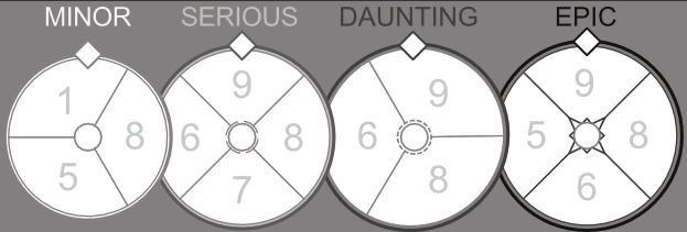
Solar Crown Online looks just like Ironsworn in a lot of ways, except for one very central one; the progress tracker looks like THIS:

What the heck happened?
Let's talk about it. But to start... let's look at a chart!
A tiny bit of chart analysis (I swear)
Ok so let's say you want to hack the Ironsworn roleplaying game. Where do you start? Of course you want to play it a bunch, get a general feel for the land. Then maybe you want to take it apart the way a mechanic learns about an engine by deconstructing it. I'm a lazy designer and I go by gut feeling a lot more than this analogy probably indicates, but I knew that I wanted to create a slightly different feel for Progression and so before I could change out any pistons, I needed to understand at least some of what the previoius mechanic had done. Here's an example of that:

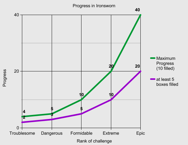
This is a chart of the progress "hits" for what it takes to reach two common milestones in Ironsworn challenges... the green line is for a fully-filled progress track (which of course isn't even a guarantee of a Strong Hit on the resolution move but that's another story and I actually love that tension and kept it for SCO), while the purple line represents hitting *at least* five of the ten boxes so a fairly clean shot can be made at rolling a Weak Hit at least.
Some observations: If we ignore Troublesome, each challenge takes exactly double the effort of the previous one to reach the same outcome. The difference between a Troublesome and Dangerous challenge is bizarrely small, and yeah, to address the elephant in the room, Epic is really huge compared to the entire rest of the graph.
To continue my ill-advised engine analogy, the system is a lot like a gear box: the input of marking progress into the system is multiplied depending on what layer of challenge you've set (your 'gearing').
Without getting too wrapped up in the thought process that led me to it, I knew that I wanted to change a few things about the system for SCO. The first thing I wanted was a more linear advance of challenge, especially by the top. Epic challenges are really cool in Ironsworn and fit that game's mood of Iron age heroics in a world where success is never guaranteed and the odds against your triumphs are stacked, but it just wasn't quite what I wanted for SCO, which is set in a genre more responsive to a main character's heroic "input" and interested in more frequent, almost episodic plot shifts as the player moves from one task to another.
Secondly, I wanted a system that was linear to the viewer, so that it was more natural to guess at how far away you were from completing your quest. The difference between having 2 boxes of Progress filled on a Dangerous journey vs. 2 boxes filled on an Epic journey is HUGE (4 segments left to go vs. a staggering 32), just as an example, even though those two circumstances look nearly identical on your player sheet.
Finally, because I'm a Blades in the Dark nerd, I wanted clocks to fill. That is a silly graphical fourish and I don't necessarily recommend it to anyone, but it's just what I'm into these days.
Categorizing your Story
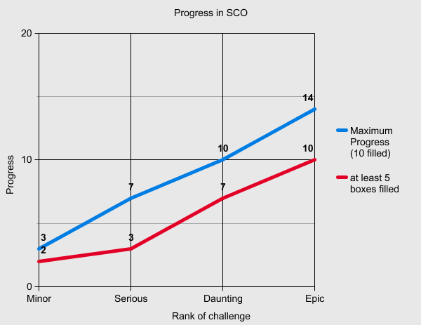
So what did I feel SCO should look like? Here's a peek:

This distribution is subject to change (in particular the red line), but overall it's about where I want it to be. Some quick hits as to what has changed: There are four categories to choose from now instead of five, with 'Serious' a middle ground between what used to be Dangerous and Formidable, while the new Daunting is like Formidable but has it's halfway mark pushed up higher, and the new Epic is considerably brought down to earth.
The progression is more linear in the visual sense as well as mathematically, as I decided I wanted a system where every mark of a box had equal weight (what changes, instead, is the number of boxes to fill). That meant the math was more directly to hand for me to manipulate, and so each layer of the progress clocks has it's own customized Progress Score break points.

An example of the idea of 'custom' math: if playtesting makes me decide I need to alter the balance of probability for completing a Serious challenge, I can just change the Progress Score values in that clock without tampering with the entire system and causing ripple effects on, say, Epic challenges.
When you make a big change to a system it's almost never entirely upside though, as any engineer will tell you. The compromise I made here was that the system is a bit more "stiff", it's not possible to attempt to complete any challenge at any time. Instead you have to hit a minimum milestone before you can attempt a progress move to finish your journey/quest/etc. I rationalized this in MMO terms: unlike a raw flesh-and-blood setting like Ironsworn, you can't always attempt to finish a fight against a giant boss monster until all four of it's health bars are brought down from out of the stratosphere! Most quests will have a bare minimum of effort required, which in some sense is much the same as how Ironsworn works in practice. Still, it's an experiment in how much people will be willing to meet these design changes halfway.
There are a lot of dynamics that change with this shift, and the design phase isn't totally done. So we may still see more iteration and changes down the road. That means that your feedback is important! If you've read this far, let me know how you feel about the changed Progress categories: Is Epic still Epic-feeling enough for the kind of stories you try to tell with Solar Crown Online?
Files
Get Solar Crown Online
Solar Crown Online
a solo tabletop rpg of perilous quests in an MMO
| Status | In development |
| Category | Physical game |
| Author | Charles Simon |
| Genre | Role Playing |
| Tags | Cyberpunk, MMORPG, Singleplayer |
Comments
Log in with itch.io to leave a comment.
Hello! I commented about this on the Reddit board earlier. My so-far only Ironsworn game had me house-rule that I'd completed my quest because I hadn't understood what a proper unit of progress was. (Escort a guy to a grove and back; probably should've treated getting there and other steps as progress. So I'm no expert.) If you're introducing this system to new players you might want to say outright what kind of things should trigger quest progress.
About the clocks specifically... I like that you're reducing the vow/quest levels from 5 to 4 and not having an absurdly high Epic level. I still feel that having four dials like that might puzzle new players though. Is there some way you could express the idea with a single dial? I'm imagining a 20-box track with marks at the 5/10/15/20 levels where the player fills in 1 box every time and works toward a specific number -- but that doesn't properly express the idea that you can try to win early, with risk. If you really like the dials, what if you tried having one dial with 3 little checkboxes beside it? Then your rule could be like, "each time this clock fills, mark one box. When you have [quest level] boxes filled, then you can make a win-quest roll and pay attention to the numbers on the clock." Mechanically I think that would be almost the same, and it would take up less space on the page and maybe be easier to understand.